A fresh view of Trewithen
To us, as to others, Trewithen is a gem with many facets. It’s a historic house as well as a modern family home. It is gardens, parkland, farmland, farm buildings, woodland, a tea shed, plant sales… The list goes on.
Its variety and diversification are what makes Trewithen so special. Many things to many people, it’s a place that’s firmly focused on the future, as well as being grounded in the present. So, with an eye to tomorrow, we chose to set about defining who we are and where we’re going through a no-holds-barred rebranding exercise.

Defining our substance
The real magic of any plant – the delicate biochemistry that makes it thrive – lies beneath the surface. The same is true for brands. You might have noticed that our website has changed, and that our logo and colours have been refreshed. The “look” of the Trewithen brand has been reconsidered, but this is just one of the ways we can see it flowering. We’ve also spent time examining and interrogating what underpins Trewithen.
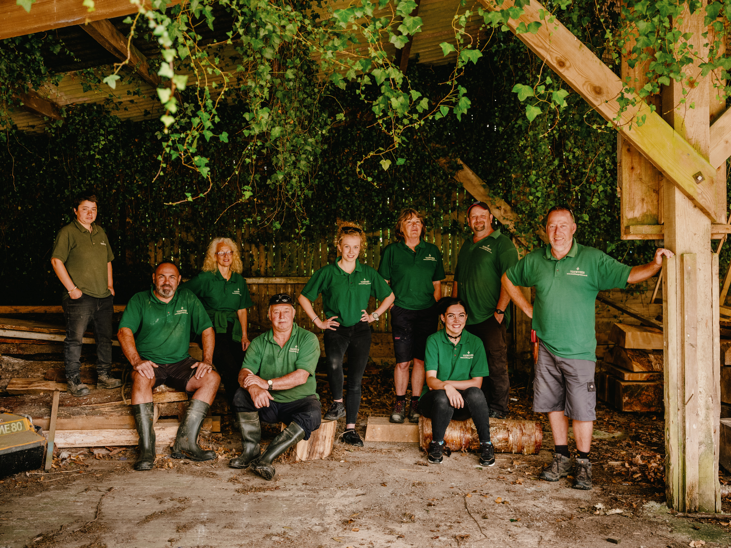
To do this, we partnered with a specialist team from the Hayle-based branding agency, Nixon. During a “deep-dive” immersion process, Nixon visited Trewithen to host workshops with the team, asking for thoughts from everyone – from Sam and Kitty Galsworthy to our gardeners, estate staff, and house guides. At this stage, we were able to share what makes Trewithen unique and how we engage with those who love it, as well as touching on the shape of our future. From here, Nixon were able to help us define the all-important markers that guide us: including our brand vision, ethos, values, personality and tone.

Creating our style
With these elements uncovered, we could begin exploring how they fed into the way our brand looks: our logo, colour palette and illustrations. A walk around the house, gardens and parkland provided plenty of references for the Nixon team to work from. Georgian-inspired colours, nature-led hues and family symbology all helped to form our visual identity.
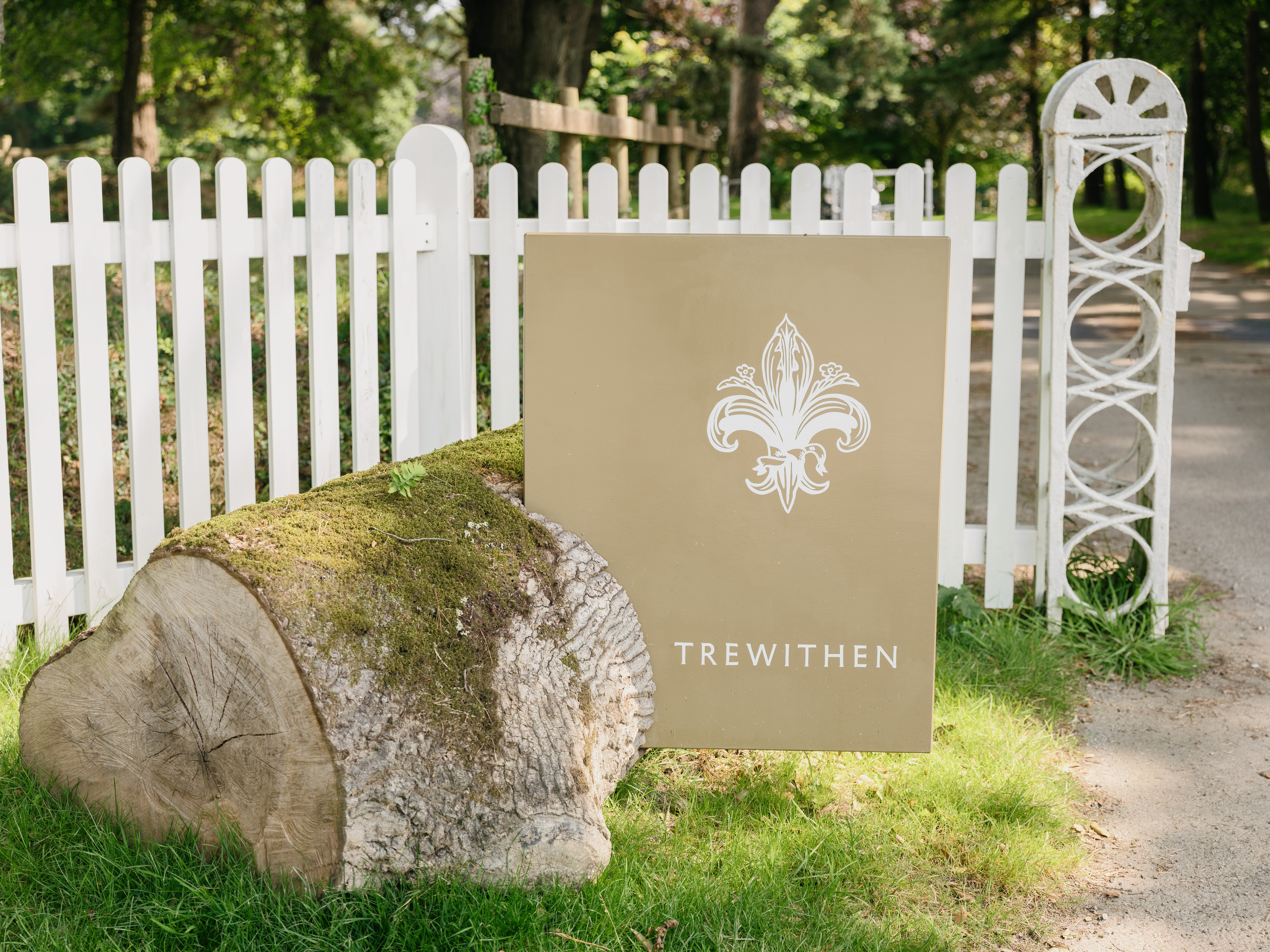
The final style pays tribute to our past while recognising that the estate and family take an ever curious and dynamic approach. You’ll spot subtle cues from in and around Trewithen, including a linocut version of our ubiquitous fleur de lis symbol, which originated as part of the Hawkins family coat of arms.

Bringing our brand to life
From these roots, we could begin to grow. Introducing the brand, the Nixon team have redesigned and rewritten our website. As part of this, we commissioned fresh photography that captures Trewithen in an entirely new and breathtaking light.
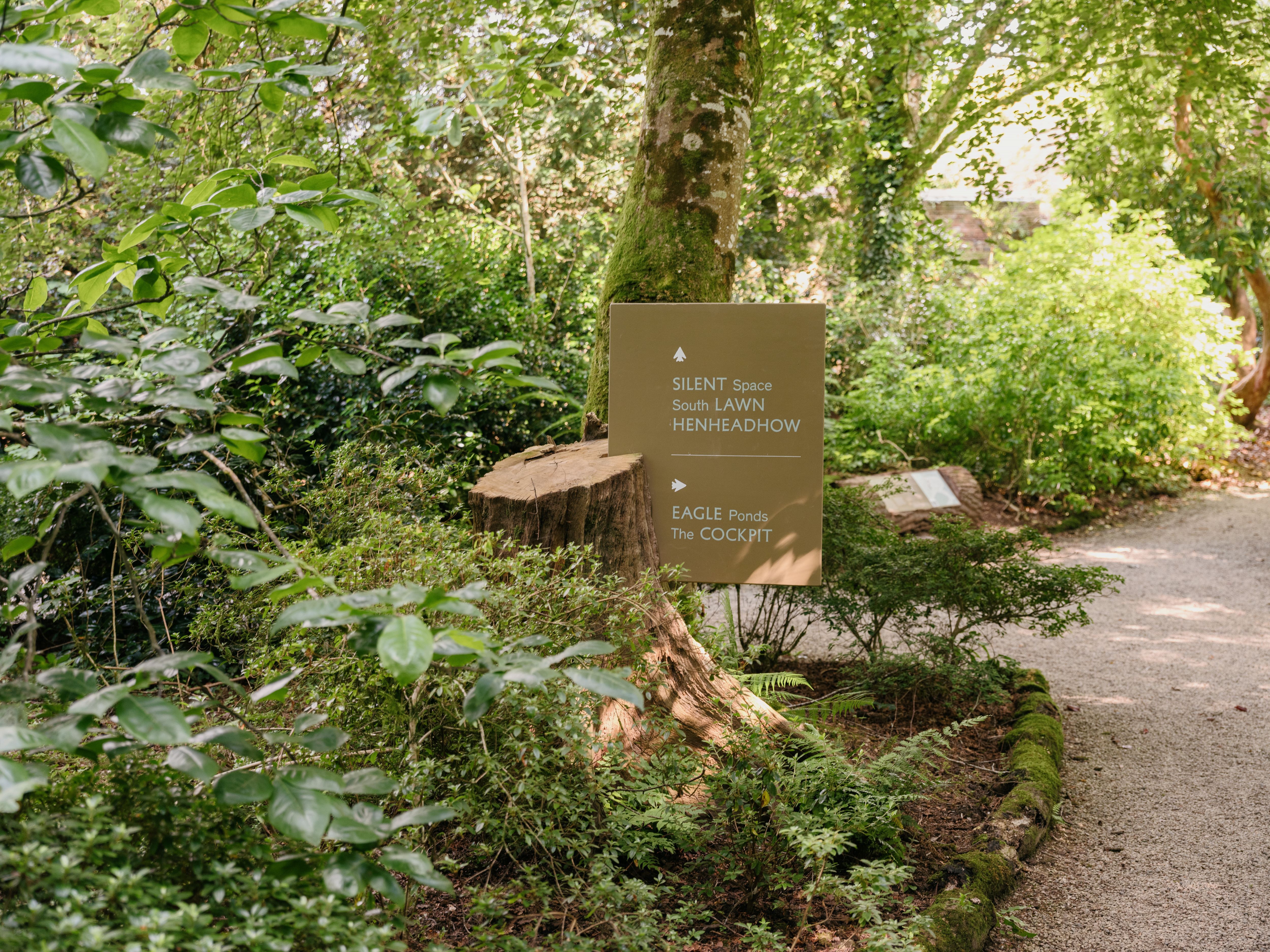
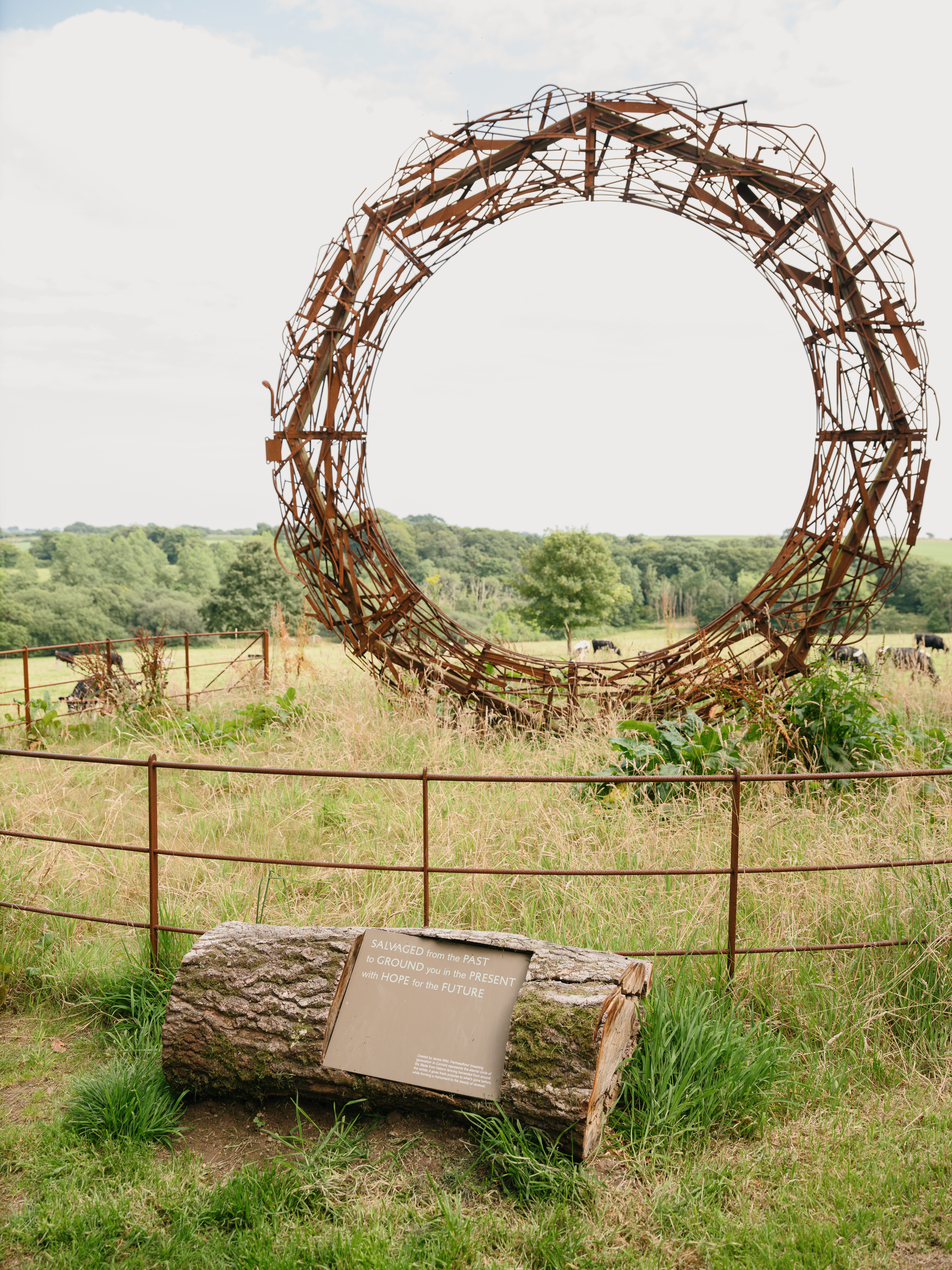
Across the estate, too, you can notice the difference. As you wander the gardens and parkland, you’ll encounter our updated signage and wayfinding points. Written in our new voice, these feel friendly rather than officious (there are no ‘Keep Out!’ signs here). Likewise, cheap imported materials or an excess of plastic really aren’t our style. So, while rolling out the new brand identity into refreshed signage, we thought carefully about what we used, opting for reclaimed wood from around the estate.
Trewithen has always been a brand with purpose, and we’re very lucky that everyone here shares the same ethos. But now, with these elements clearly set out and singing through in all that we do, we can move forward with even greater focus. For our visitors, this change might be subtle. But as you explore Trewithen’s many sides, the clues to our brand are all there in the wider experience. The quality, commitment and outlook of Trewithen are what will endure well into the future.

Thank you to Nixon
'Evolving and refreshing the livery of the estate and garden is not something we ever took lightly – as I understand it this is only the third such iteration in the three centuries of Trewithen’s standing, so we needed someone that would approach this project with the necessary respect, patience and an uncompromising spirit, as this is more than a generational decision.
The craftmanship and love that went into this work will last at least 100 years from now. It is this sort of approach that has stood the land we steward here in good stead, and we should treat the brand no differently. Using Nixon as our partner in this endeavour was a masterstroke as they truly understood and were sensitive to the intricacies and stories that Trewithen tells. We are thrilled with the stunning evolution of this look and feel.' Sam Galsworthy.
photos © Danny North